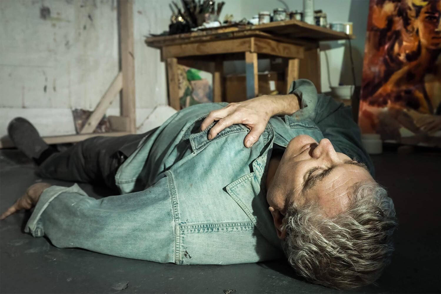
In the Studio with Walter Robinson
INTERVIEW
Published Nov 25, 2020
Have you managed to remain busy making work during the pandemic?
I’ve been lucky. I bike across the Queensborough Bridge to my Long Island City studio, so I’m able to work with minimal exposure to the virus. I still have a lot of paintings I need to make. And fooling around in the studio is a constant entertainment.
Your painting Women III, which depicts a Tampax box and is included in This Sacred Vessel (Pt.3), was first exhibited in your Metro Pictures exhibition in 1985. How was this painting and the exhibition received at the time?
I think it was pretty much ignored. Woman III was intended as a reference to de Kooning, of course, and fertility, but my intentions were derailed by headlines about toxic shock. What I informally called “shy Tampax” - it’s the back of the box - was one of the larger paintings in the show, whose subjects also included a mostly empty bottle of vinegar, as might be used to douche, and a plastic pump bottle of Johnson’s baby oil, which was bought by the company for its corporate collection. That was part of the plan, actually.
Other subjects were aspirin and lotions and a row of pharmaceutical pill bottles, which referred to the AIDS epidemic.
Alongside your pulp paperback cover paintings, you are known for still life paintings of everyday consumer products, which elevate these mundane items into icons of desire. Could you discuss the motivations with this part of your practice?
Well, I wanted to have a still life line, you know, to be a well-rounded painter. And my obsession was with things that I desired. Desire is biological, it’s caused by chemical effects in the body, thus my interest in subjects that change the blood chemistry, notably liquor. I began by doing a whole series of paintings of beers, two sixpacks at a time, cans or bottles actually, as an exercise in sprezzatura. They’re called “Two Sixpacks” but show only five or so beers, the idea being that I had already drunk the others. Thus the “studied carelessness” of the rendering was linked to my blood alcohol level. I painted four different brands as color studies: Heineken, which is a transparent green; Miller, golden yellow; Guinness for a rich brown; and Budweiser, which is American red white and blue. One early still life shows three items in a frieze-like row: a bottle of Hennessy brandy, a pack of Camel cigarettes, and a square pocket container of Bayer aspirin. Everything was yellow with brown highlights. Another color study.
From there I took up pharmaceuticals, thinking of how much I sometimes wanted those medicines, aspirin or decongestant or antacid, and thinking that my paintings could piggyback on that physical desire. Also viscous products like Vaseline or K-Y, which could be given a viscous painterliness. Eventually I turned to food. I painted a seven layer cake because of the stripes, and stacks of brownies or cornbread because of their minimal gestalt. The images are copied off the front of the boxes of mix. It turns out that lots of modernist sculpture is based on baked goods.
The cheeseburgers are different. They model the subject as ideologically interpellated.
Through appropriating images of romance or your still life paintings you have explored the theme of desire and how emotions are shaped by culture since the 1980s. How has your work adapted to contemporary consciousness over time?
The meanings of cultural signs can morph in rather surprising ways. I had a series of Vietnam GIs as tragic figures, but once Reagan invaded Grenada the pictures became jingoistic and were ruined. I still like the romance genre very much; despite all the changes in the superstructure, the biology is ever present. The salad paintings - you have one, of arugula, everyone’s favorite - are about trying to master your own biology and be healthy. Salad is common in everyday life; as a subject for painting it’s fairly rare. And salad greens are nature’s brushstrokes.
Can you discuss how your still life paintings relate to other mediums or genres such as sculpture or abstraction (e.g. "Lucky Strike" background’s color field quote)?
For some reason I’m amused by the parallels that can be found between the mundane and the spiritual. The persistence of abstract patterns on everyday garments, for instance white polka dots on a navy field, a scrap of the cosmos brought down to street level. For some reason, the design of cigarette packages, already evocative of geometric abstraction, made me think of Diebenkorn’s Ocean Park series, whose delicate color harmonies seem to be a completely different order than the trappings of nicotine addiction.
In addition to your art practice, you have had a career as a writer. Can you describe the relationship between each profession and to what extent do they inform each other?
Ah, well, a lot can be said on that question. But let’s leave it at this: Critics are interested in many things. Artists are interested in one - themselves.


